# Date the work was done
March 2021
# Introduction
Developing a service that uses GDS patterns gives us confidence that we can build something accessible to all users. However, we want to be sure the amendments we make, functionality we add, and the way we develop does not incur any additional or unnecessary barriers, thus ensuring all users regardless of ability, equipment or environment can access our service.
Our prototype is not our final product and has not been developed using production code, however we can use it even at this early stage to highlight any potential barriers. This first round of testing is to get a feel of how accessible our prototype is using some common automated tests.
# Automated testing
Automated tests, and those that mimic how a user with additional needs may interact with a service, can be highly effective, but they should never be used in isolation and never replace tests with real users. They are, however, a good indication to how effective a service might be to those users that need an adaptable environment.
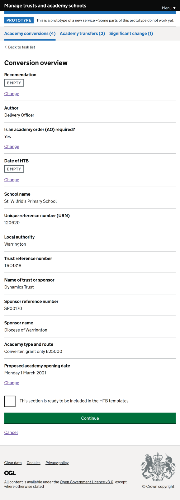
# Colour contrast
Good colour contrasts can really benefit users with low vision or colour vision deficiency (colour blindness) which is why having sufficient contrast is a pass/fail requirement for the W3C web content accessibility guidelines (WCAG) .
Using automated software, we used WAVE’s browser extension, which allowed us to evaluate our web content for accessibility issues, contrasts can be (relatively) easy to verify. All colours currently in our prototype pass the automated check for the W3C’s Web contenet accessibility guidelines AA compliance.
WAVE screen shot
# Colour blindness
When colour is used it can have potential issues for user with colour vision deficiency (colour blindness). Most people with colour vision deficiency have difficulty distinguishing between shades of red, yellow and green. This is known as “red-green” colour vision deficiency. It’s a common problem that affects around 1 in 12 men and 1 in 200 women (NHS April 2019). Colour emulators allow us to mimic how a screen might appear for users with different type of visual colour deficiency and highlight any potential issues.
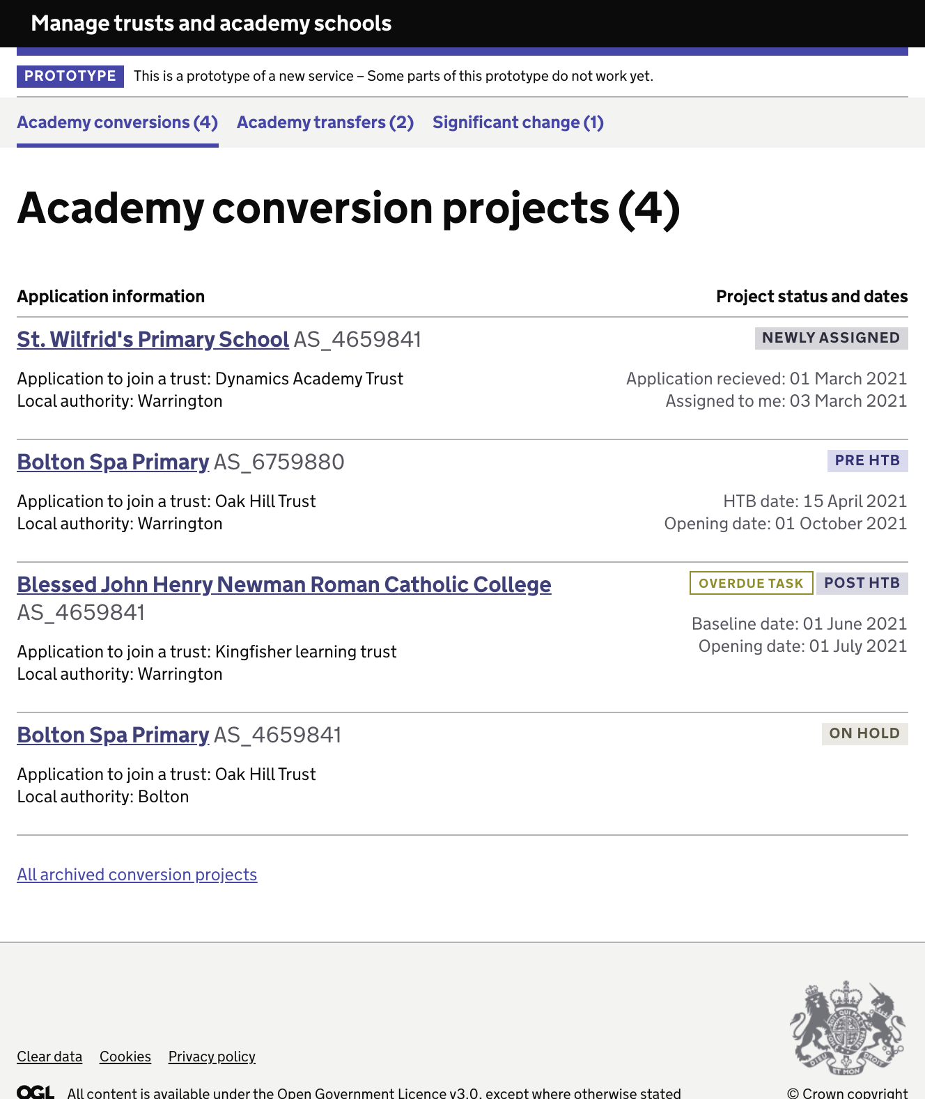
Projects page when green is greatly reduced
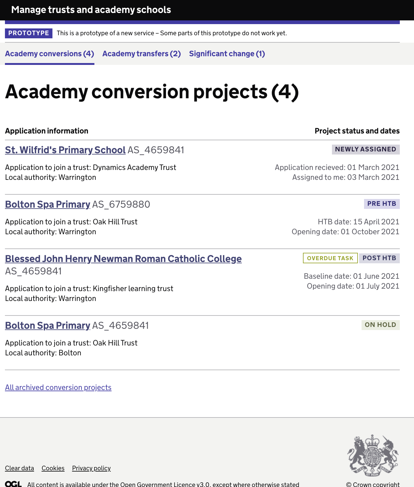
Projects page when red is greatly reduced
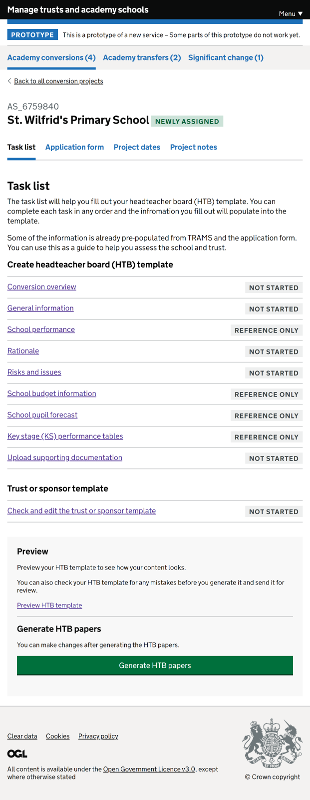
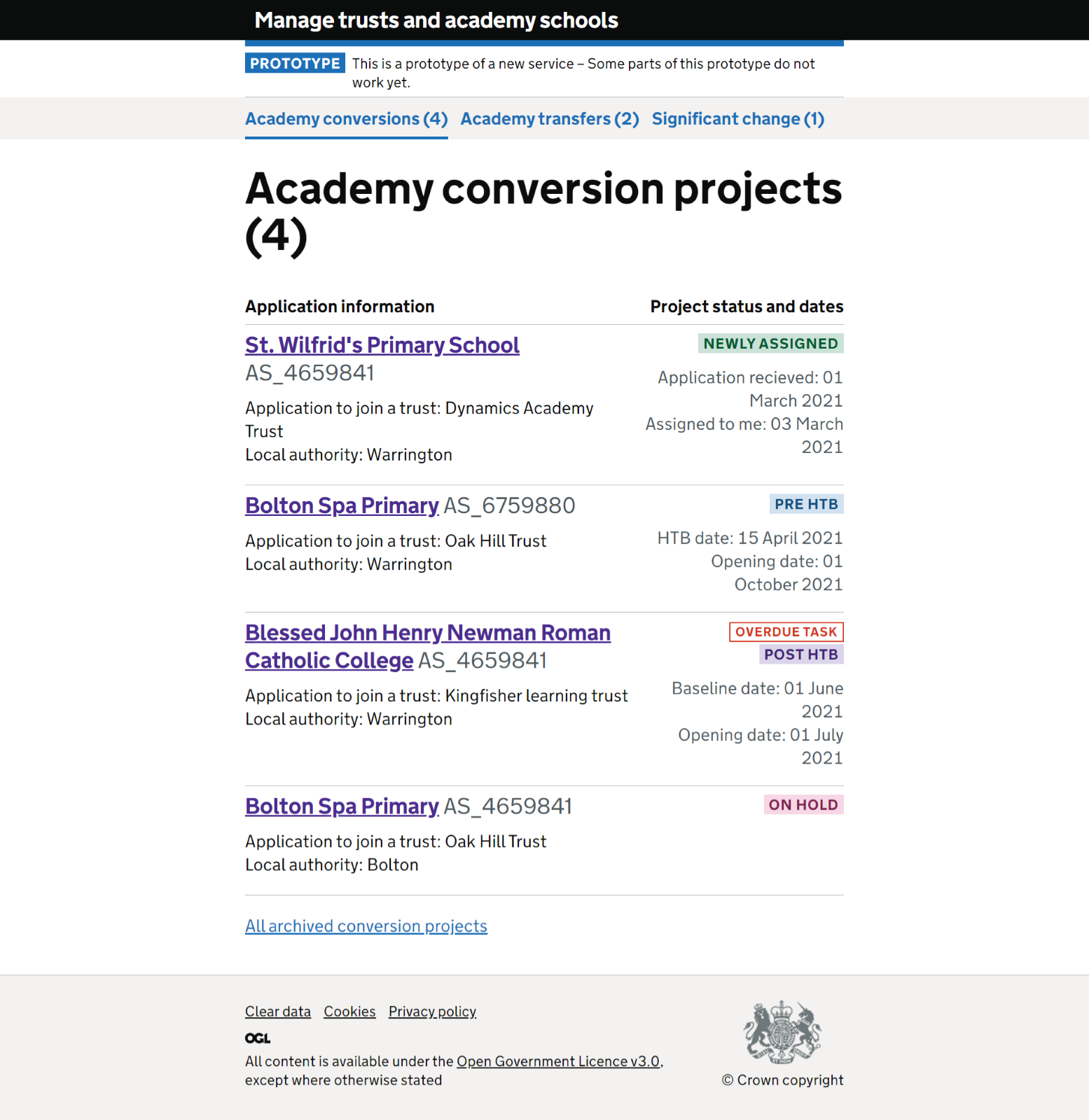
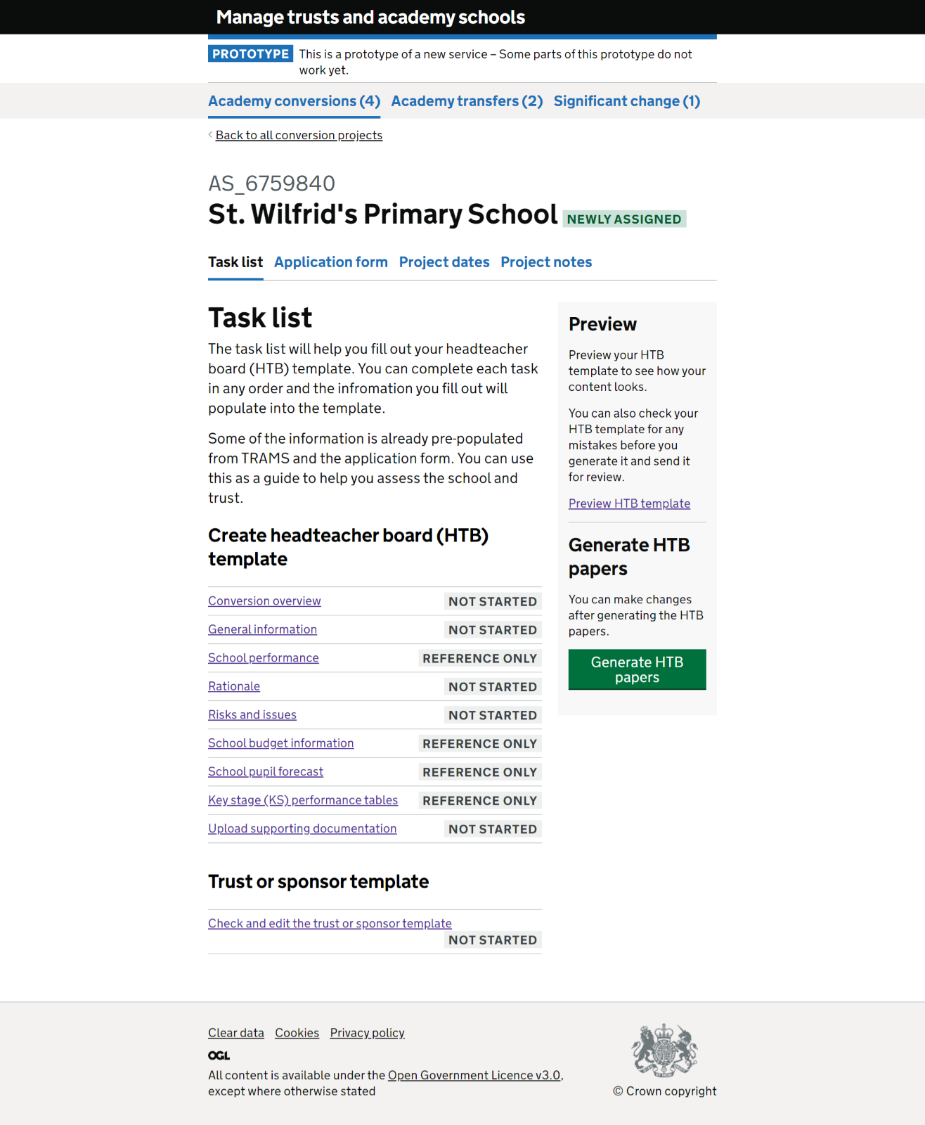
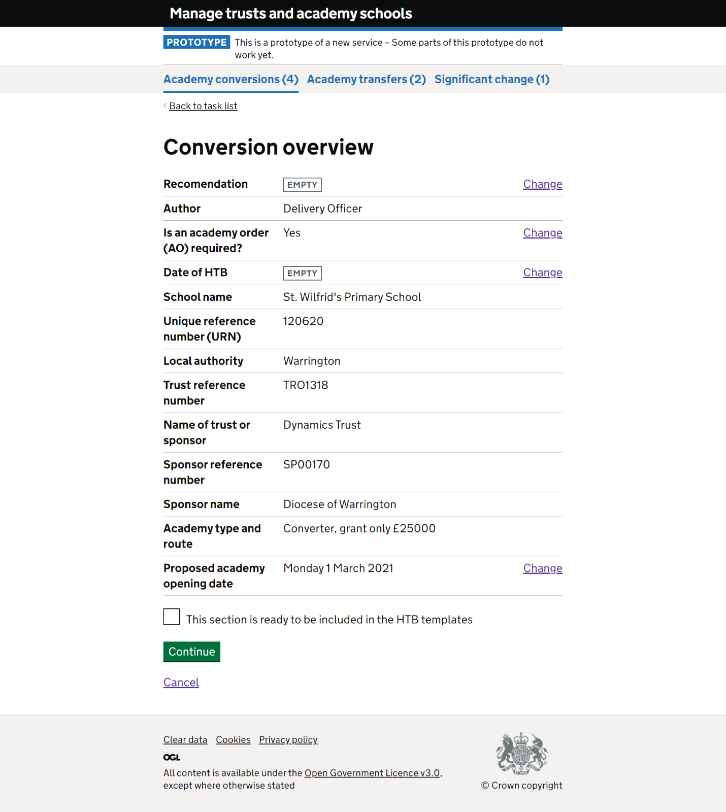
# Zoomed view
We noticed during our last round of testing (March 2021) that 2 participants had their screens set to maximum zoom. For one of those participants this gave them a mobile view of the service. To ensure our service is accessible to users who require this view we examined several key screens in the same way. Although most screen behaved as expected the preview template section had some tables that did not resize correctly, this has since been rectified.
Zoomed in task list page
Zoomed in summary page
Zoomed in preview page
# Large text
Increasing the text size to the maximum available through browser settings maintains the integrity of the layout. Although there are some alignment changes, the content still appears in a logical position.
Zoomed in preview page
Zoomed in preview page
Zoomed in preview page
# Dark mode
One user explained they sometimes had difficulties using lighter coloured screens and always preferred a dark screen. We know it is important for users to make these kinds of adjustments and for the system to be flexible enough to accommodate. Testing with a dark reader (https://darkreader.org) we were able to show that the interface currently converts to dark mode well.
Projects page dark view
Zoomed in preview page
# Ability to change fonts
An important adaptation is to allow users to be able to change the font of the service. This can be particularly important for users with neurodiverse conditions such as Dyslexia. This example shows how the service would appear when the fonts are swapped for Open Dyslexia a free typeface / font designed to mitigate some of the common reading errors caused by Dyslexia.
Task list page using open dyslexic font
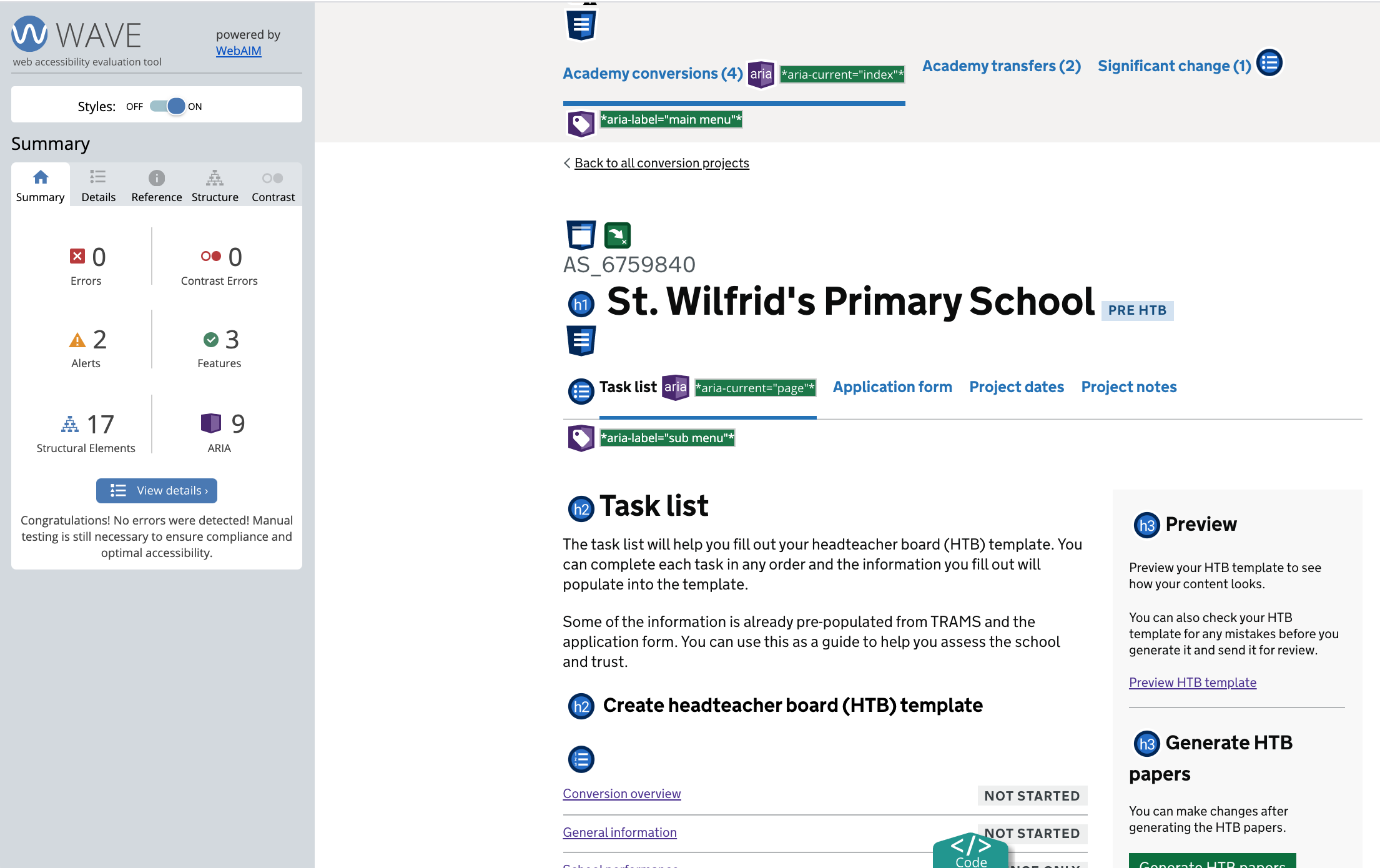
# Further automated testing
We did some quick page checks using WAVE’s browser plugin to ensure we have visibility of any potential high-level accessibility barriers before development. This task highlighted several potential issues within the HTML code, that may cause issues for users relying on screen readers. These issues include, but are not limited to:
- Duplicated and empty links on projects list page causing issues with tabbing order.
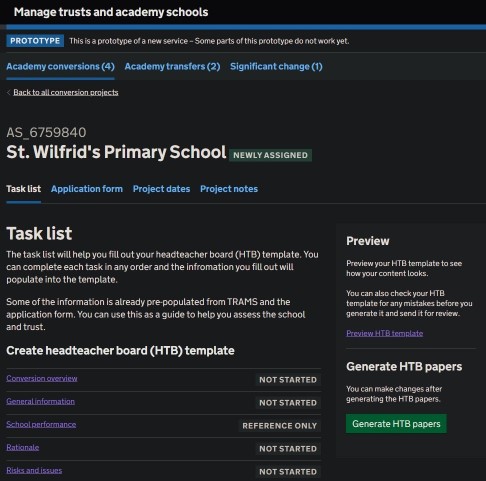
- Nested list items on task list page.
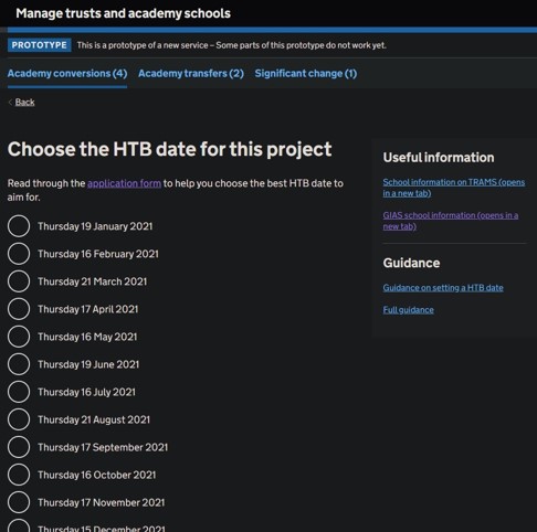
- Grouped radio buttons on task pages with no fieldset tag .
- Grouped radio buttons on task pages with no legend tag.
- Input boxes on task pages with no labels.
- Empty cells in tables, occurs in the preview section.
- Task and progress tags on task list page should be grouped by Aria.
- Project numbers need to be read as individual numbers and not as a whole number.
We will ensure these issues are addressed when the service is in development.