# Date the work was done
May 2021
# Overview
# Research goals and objectives
- To usability test our prototype, can our users complete the tasks we ask them to?
- Evaluate whether the users can easily navigate to the reference sections and submitted application to aid task completion.
- To obtain feedback on our prototype from a more diverse range of users regionally
# Research participants
We ran one-to-one usability testing research session with six project leads.
We managed to obtain a regionally diverse range of users, with 1 user from the North, 1 user from the West Midlands, 3 users from Lancashire & West Yorkshire and 1 user from the East of England & Northeast London
The participants had different levels of confidence in using IT systems and varying levels of experience in managing academy conversion projects.
# Research session structure
- Usability testing sessions lasting an hour.
- We did not provide a scenario this time as the sessions were more task focused.
- Participants were told that they would be completing some tasks using the prototype as if it was a real conversion, and were also encouraged to think aloud for any initial reactions/feedback when using our prototype.
- Participants were observed when completing the tasks, and each task had a success criteria which participants were marked against.
# Can users complete the tasks we want them to?
# First impressions
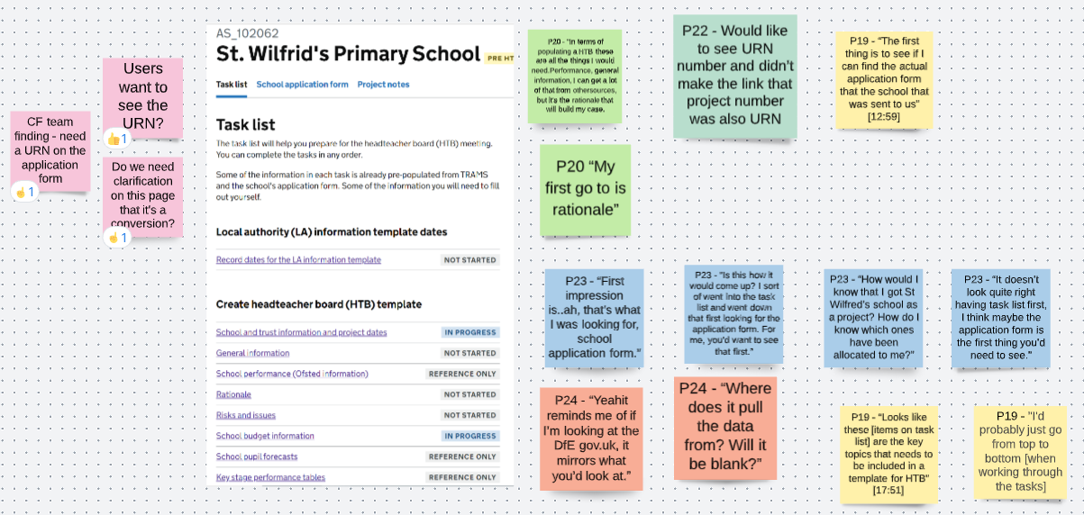
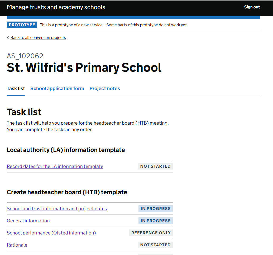
- Our users weren’t sure what to expect from our task page, as there is currently nothing like this to assist them.
- There was an expectation from some users to see the application form first due to their current ways of working.
- Generally, our task list prototype includes everything which our users normally need to be able to complete a Headteacher Board paper.
“In terms of populating a HTB these are all the things I would need.”
“The first thing is to see if I can find the actual application form that the school that was sent to us.”
# TASK - Locate the application form
- In our previous round of testing, most of the users struggled to find the application form. In this round, all our users were able to locate the application form, some even before I’d asked them to.
- This demonstrates how important the application form is to their role, and we know it is the first thing many of our users look at.
- Our service is meeting that need by including everything our users need in one easily accessible place.

# First impressions of the application form
- Current issues with existing systems and ways of working can occasionally cause errors with the incorrect application form being used. Our service resolves this.
- We are going to investigate the needs of finance teams in terms of the school application form, as they may need to see it, or something else.
- We are also going to investigate how the API could prevent errors from things such as re-submission.
- The link to open the application form in a new tab was missed by our users, we are planning on using analytics in a Private Beta to collect more accurate data on the usage of this.

“A colleague of mine in KIM found the wrong application form…this will stop that then won’t it, as you’re pulling it straight off the application form.”
“I would’ve expected it [the URN] to see it as one of the first things”
# TASK - Update the proposed academy opening date
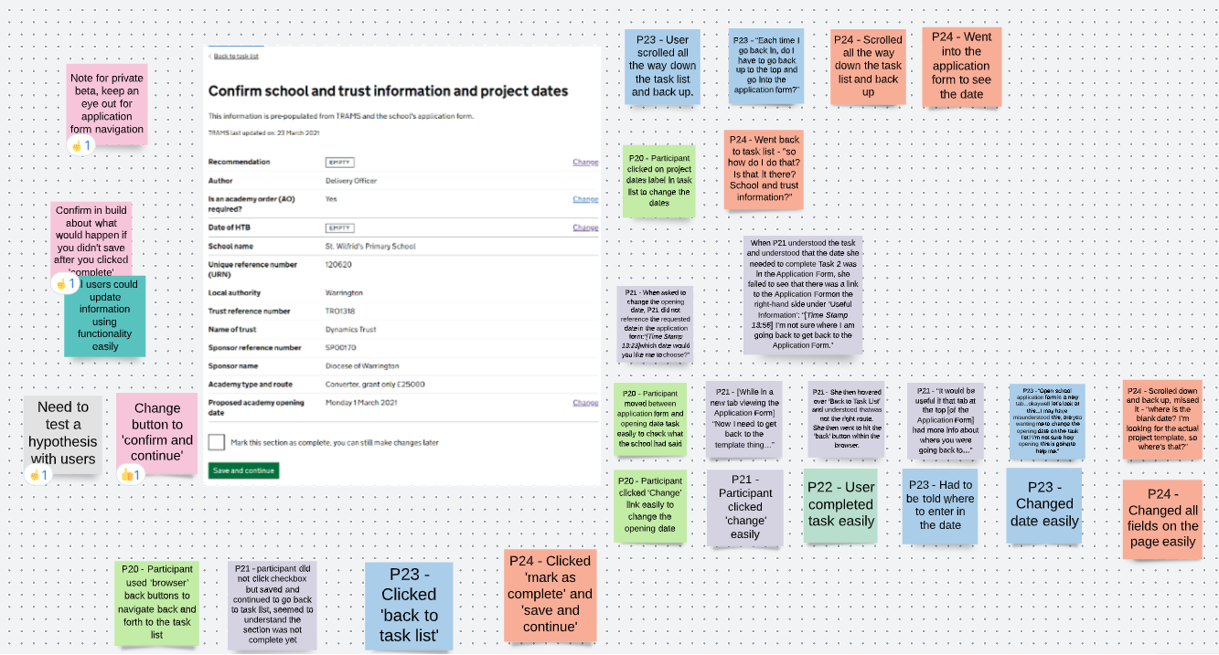
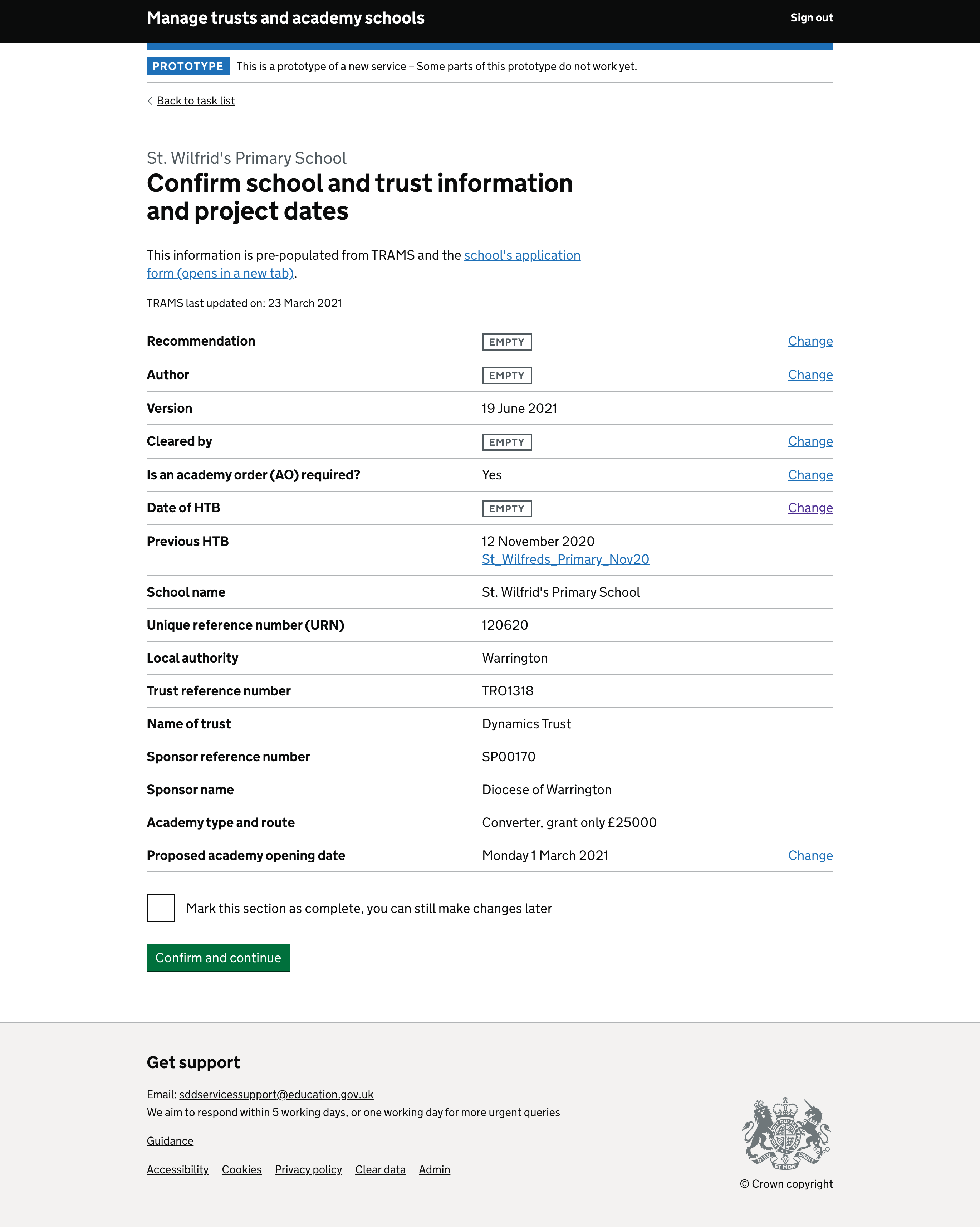
- Users had some trouble navigating between the task and the application form, especially when the form was in a new tab. We will continue to observe this in further rounds of testing, or in private Beta.
- A potential cause of this issue is that the text within the prototype tabs are not correctly labelled due to html coding.
- 3/5 users could easily use the information in the application form to change the date, with 2/5 users completing this with help.
- 4/5 users could easily and comfortably change the date without help.
“Each time I go back in, do I have to go back up to the top and go into the application form?”
I’m not sure where I am going back to get back to the Application Form.”
# TASK - Enter the distance from the school to the trust HQ
- Some users experienced confusion when locating where the distance field would be from the task list.
- The users who were not told where it was initially all did manage to locate it through trial and error.
- Entering the time it takes to get to the location is something which is important to our users.
- 5/5 users comfortably completed the task of clicking ‘change’ and inputting the relevant information.
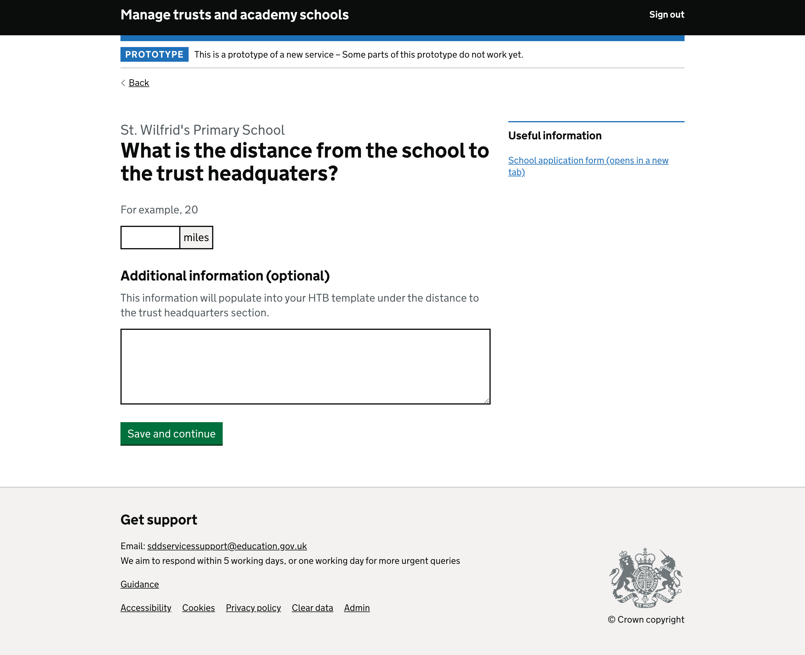
“Does it not let me put the time in? That’s what I looked at first…we’d usually put distance and time."
"They [HTB] always want to know distance and time to location.”
# TASK - Edit the rationale

- Some users had issues locating the ‘change’ link, instead first attempting to edit the ‘summary’ page. We have prioritized making changes to the visual display of the summary.
- One of the cited reasons for our users preferring to use Word over a web tool is the spell check functionality. If this feature is available and working in the web browser, it removes one of the barriers to using our service.
- 5/5 users could edit the format and the text very easily and interacted well with the functionality.
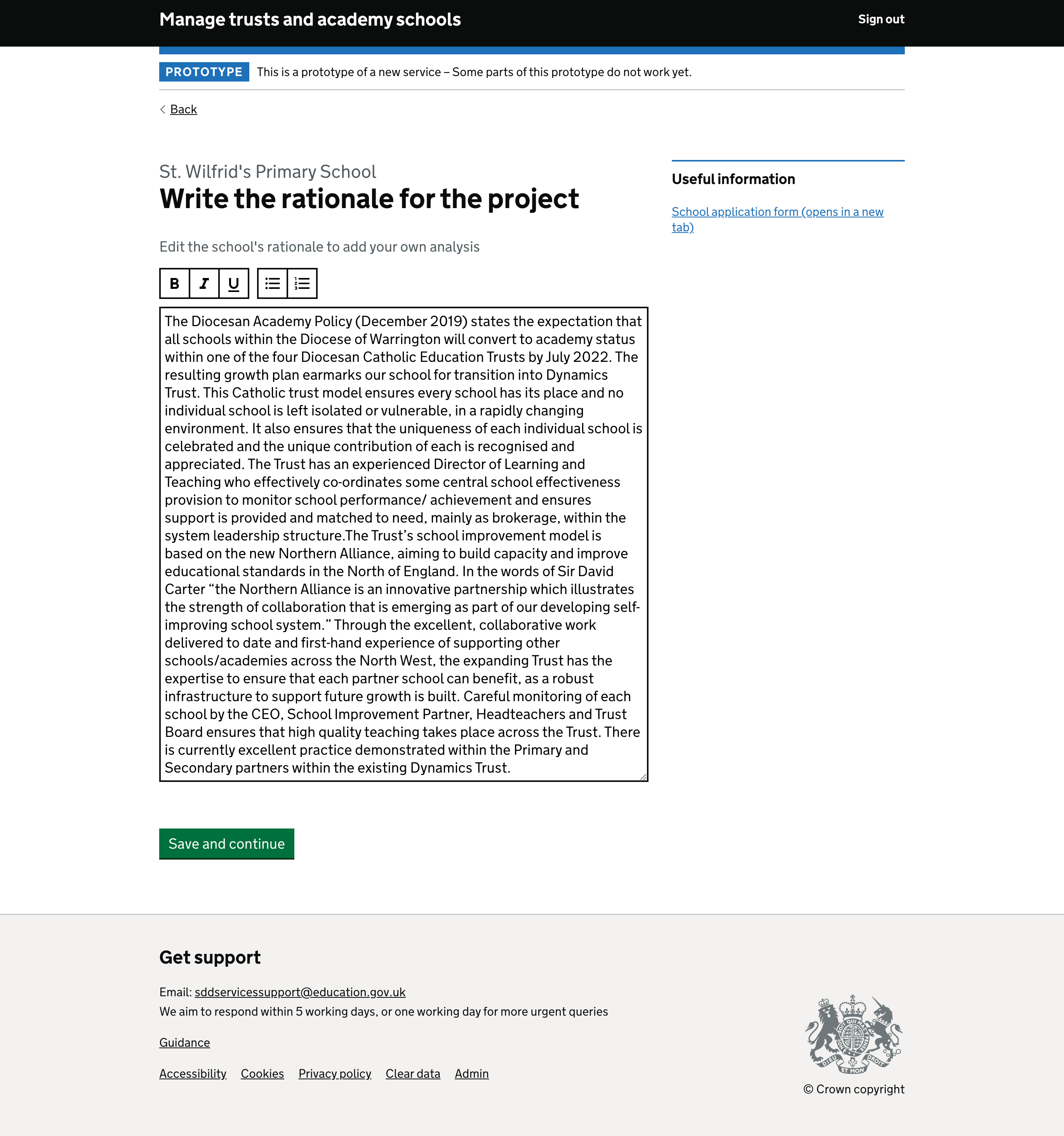
“That’s really, really easy. I suppose that takes out all the formatting of that you know maybe because you’re just literally clicking on a bullet point there.”
# TASK - Enter additional information in the School Budget Information section
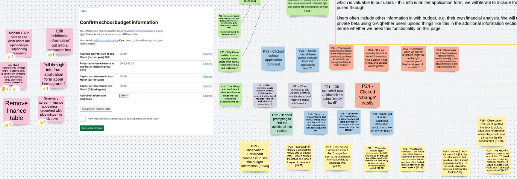
- This information was seen by users as helpful as currently, they enter this information themselves.
- Users struggled to locate the ‘additional information’ section when asked where they’d enter comments.
- The ability to enter whether schools have any loans or grants with the budget information is - something which may be valuable to our users.
- Some users include other information in with budget information, e.g., their own financial analysis. It may be helpful to monitor using analytics to see what kind of things people upload.
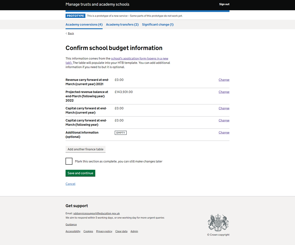
That is really helpful having it there, in the HTB template previously you have to write it in, so having it all there is really helpful."
“We do put a financial health assessment in the HTB template."
# Preview HTB first impressions
- This section was familiar to our users, which was reassuring as many of them have expressed concern around when there have been new systems in the past.
- This section was received very positively by most users. It was described as user friendly, intuitive, and improved from the current process due to pre-populated information.
- More experienced users started editing information within this page using the change links very comfortably.
- We have questions as a team around setting the minimum baseline for how much information needs to be completed before the papers can be generated.
“It’s intuitive, it is pulling it direct from where it needs to come from."
“I think it’s a lot improved from how we’ve had to do it before."
# General feedback
“I like how it’s clean, I like how there’s sections… we just work on a big Word document… we have had issues in the past where it’s [the word doc] has been corrupt because people have been passing it back and forth.”
"I was going through the tasks quite quickly…but that just highlighted how intuitive the system was that I was able to quickly find and go through the tasks quickly.”
“I think there might be some hiccups along the way like ‘oh where’s that gone’, but as you use it more you’ll get used to it.”
“As it’s directly linked into the application the school has committed, thats perfect.”