# Date the work was done
March-June 2021
# Introduction
With two rounds of concept testing and two rounds of task-based user research completed on the prototype, in addition to desk research and a period of alignment with the Academy Transfers service, we have confidence that our service will bring value and ease of use to Delivery Officers working on conversion delivery projects. As the project now moves with more velocity into the build phase and the design team turn their attention to the post-HTB part of the service it feels right to document where we are at this point.
The prototype has developed a lot since our last post which was back when we first created our HTML prototype. The changes implemented have been made for various reasons, for example:
- Two rounds of user testing.
- Continued learning around our service and the bigger picture of the service and its users.
- Collaboration with our subject matter experts.
- Adjustment of our MVP.
- Alignment with Academy Transfers and to a lesser extent the Make Changes to an Academy service.
- Pages being developed in the build environment which has challenged and consequently iterated some of the designs.
- Additional work on complex journeys.
# Changes
# Changes from research
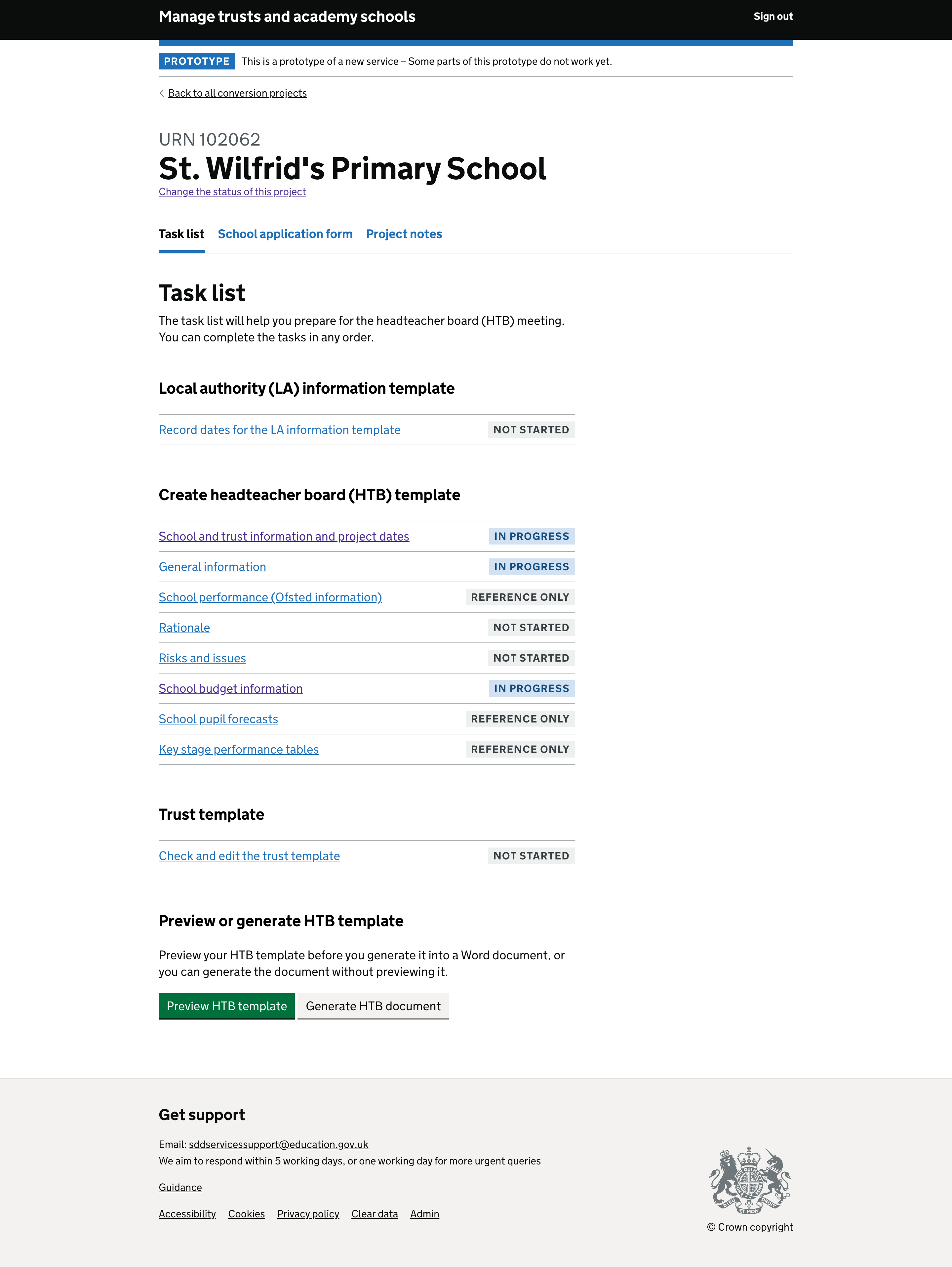
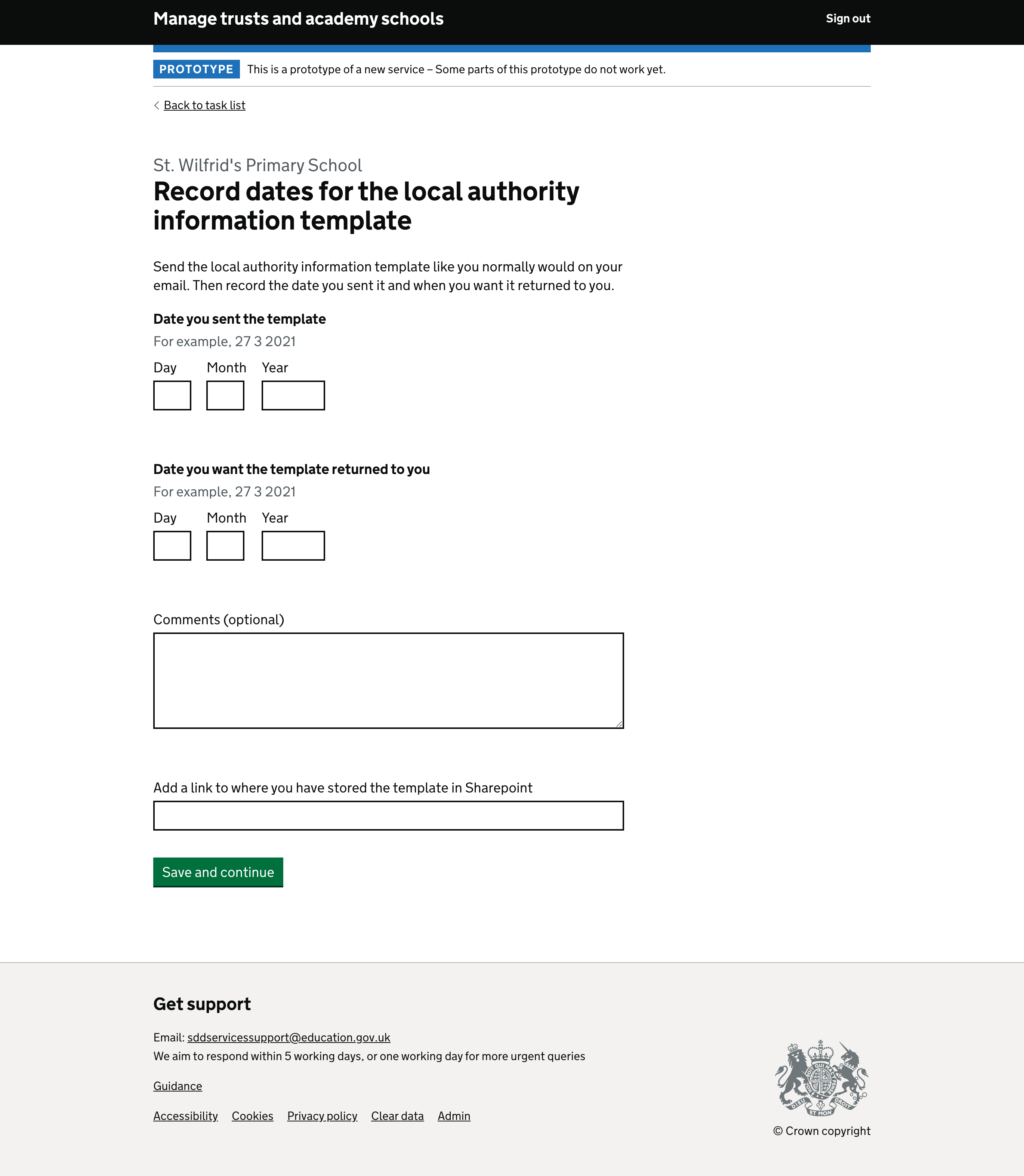
- LA information template link text changed as users expected the LA information template to be sent from the system, this was due to the word ‘send’ being used in the link and title.
- Users identified a number of fields that were missing from the prototype which we have now added.
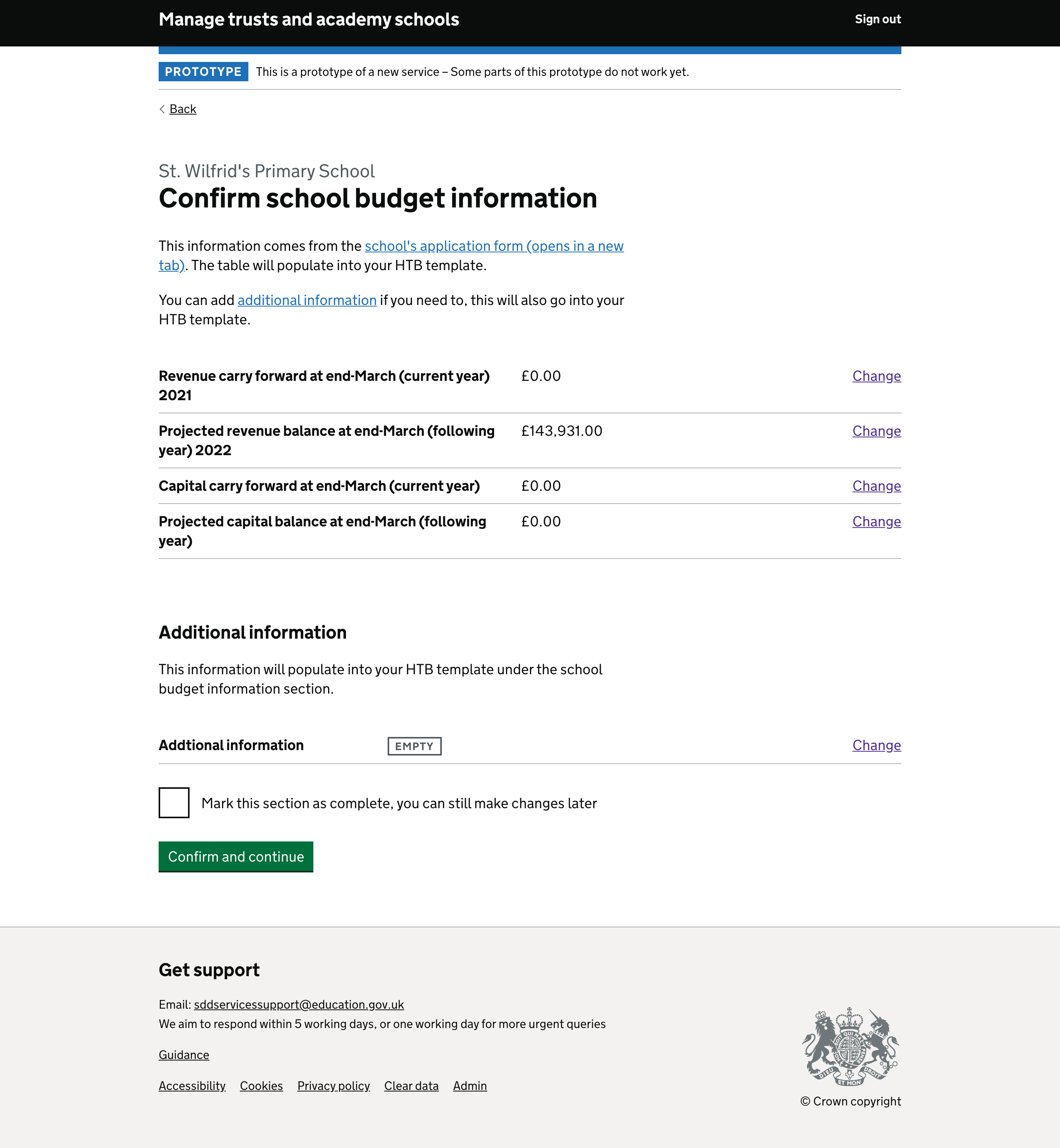
- Budget information needed to be changed from a static to an editable table.
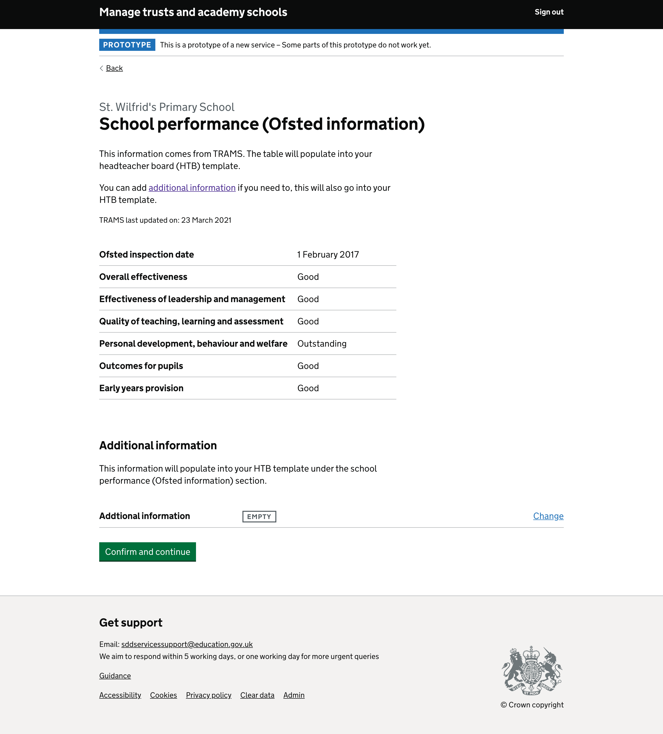
- Ability to add additional information required and consequently added to all reference only sections.
- Line length increased to aid readability on rationale summary page and final generate HTB papers screens.
- Ability to add additional information added to distance from the school to the trust task to allow users to add time taken.
- URN explicitly replaces AS_ project number as users did not recognise URN in this format.
- School application opens in a new tab to allow users to carry on from the position of the service they were in.
- Button text changed to ‘Confirm and save’ on summary pages to instruct user on what they should do
- Check box text changed so users understand changes can still be made after marking a task as complete.
- H1 changed to ‘Confirm…’ on summary pages to instruct users on what to do.
- Additional headings added to preview HTB papers page to make section breaks clearer.
- Region text added to HTB dates page so users understand the context of the dates.
# MVP adjustment
- Help and guidance sections removed - Although easily implemented, the work to get the help and guidance content into a state where it could be used in this way is a big task.
- Useful dates tab removed - We realised through research there was a lot of complexities to understand different regions so this was considered not suitable for MVP.
- Right hand nav preview HTB papers functionality removed - Although we knew there was a user need to preview the data before generating the actual HTB documents, this section felt like a duplication of the, now current, summary screen presented when the user generates the actual papers, therefore we decided to remove it – our users will tell us if we need to reinstate it.
- Newly assigned status labels removed
We’ve removed the ‘NEW’ status labels for our MVP, we need to understand more about what users would find useful to highlight in this way and how it would be assigned to a new project.
# Academy transfers alignment
- Headers and footers changed to align to Academy Transfer’s more mature version.
- Key stage tables changed to reflect the work and research AT have done on theirs.
- Removal of cancel buttons on task pages.
- Style change of the right-hand navigation to match.
- Changes to some data fields as AT helped us understand some of the complexities around data mapping.
- Character counts taken off any input boxes.
- Summary table columns widths extended
- top navigation removed.
# Additional work on compex journeys
- Status change functionality added
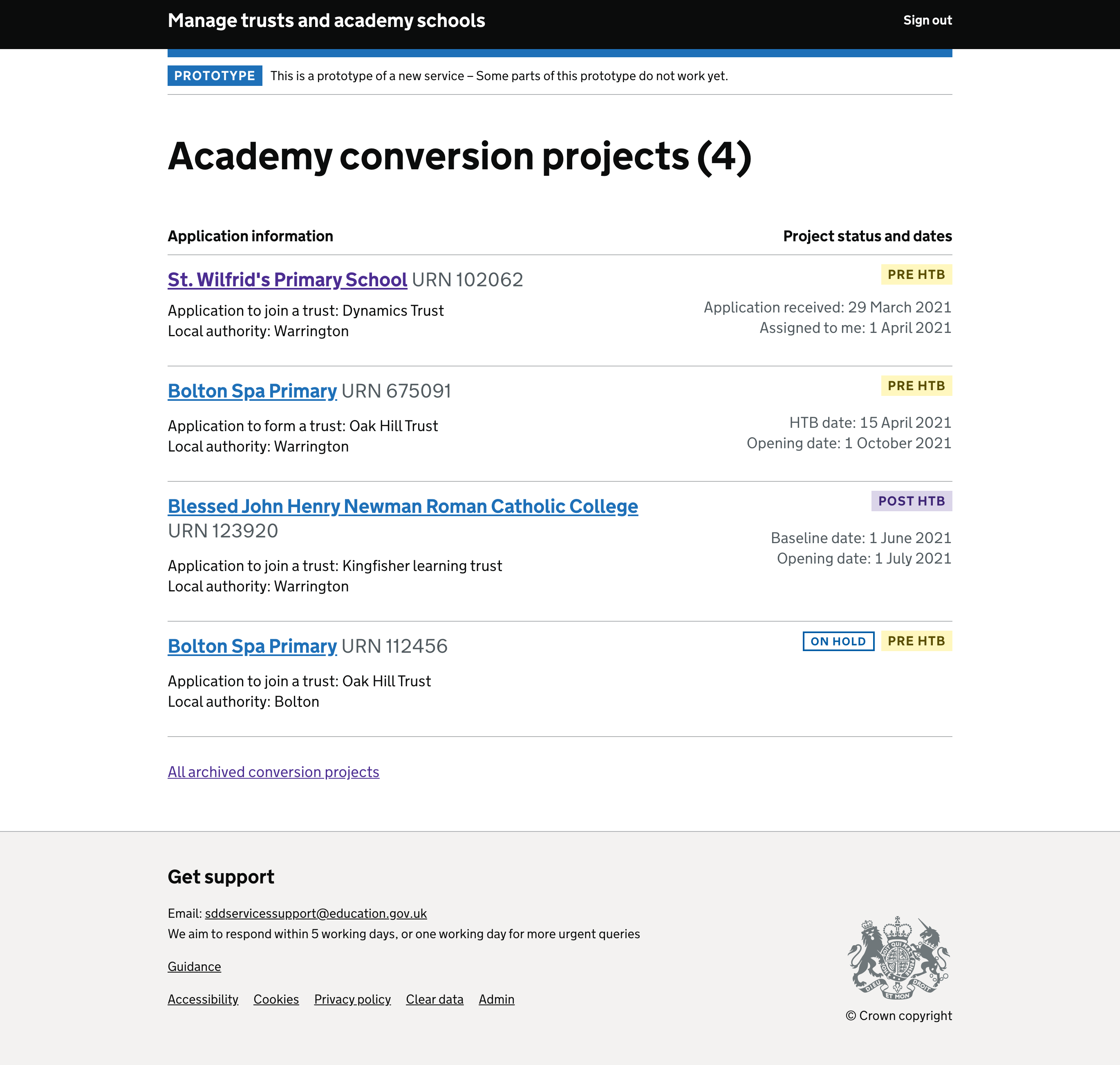
- Language changed on projects page to refer to Joining or Forming MAT
# Screenshots
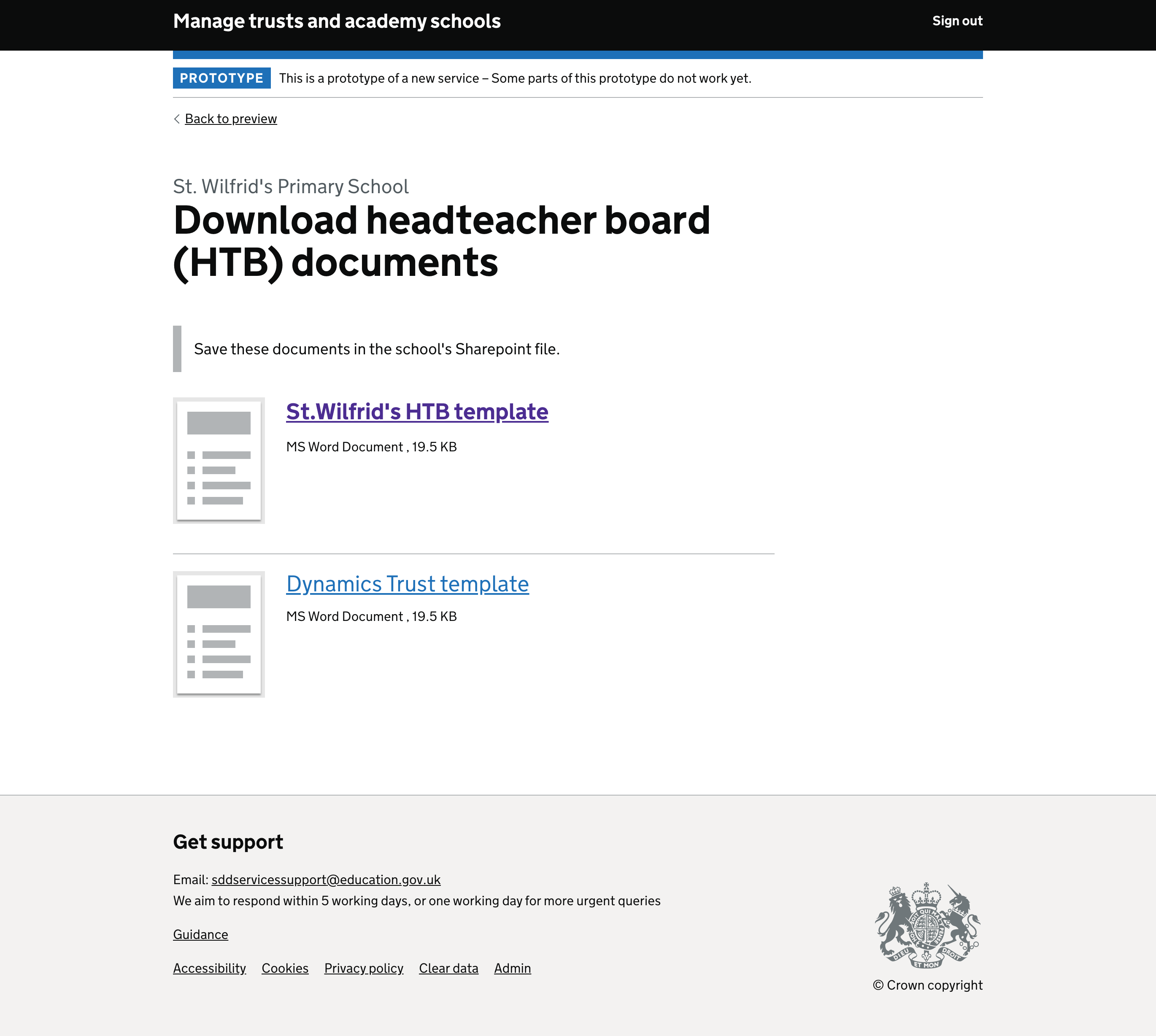
All these changes are depicted in the following screen, not all screenshots have been included as many will repeat the same design patterns.
Projects list
Task list page
Local authority information screen
Trust information and date summary screen

Overview summary
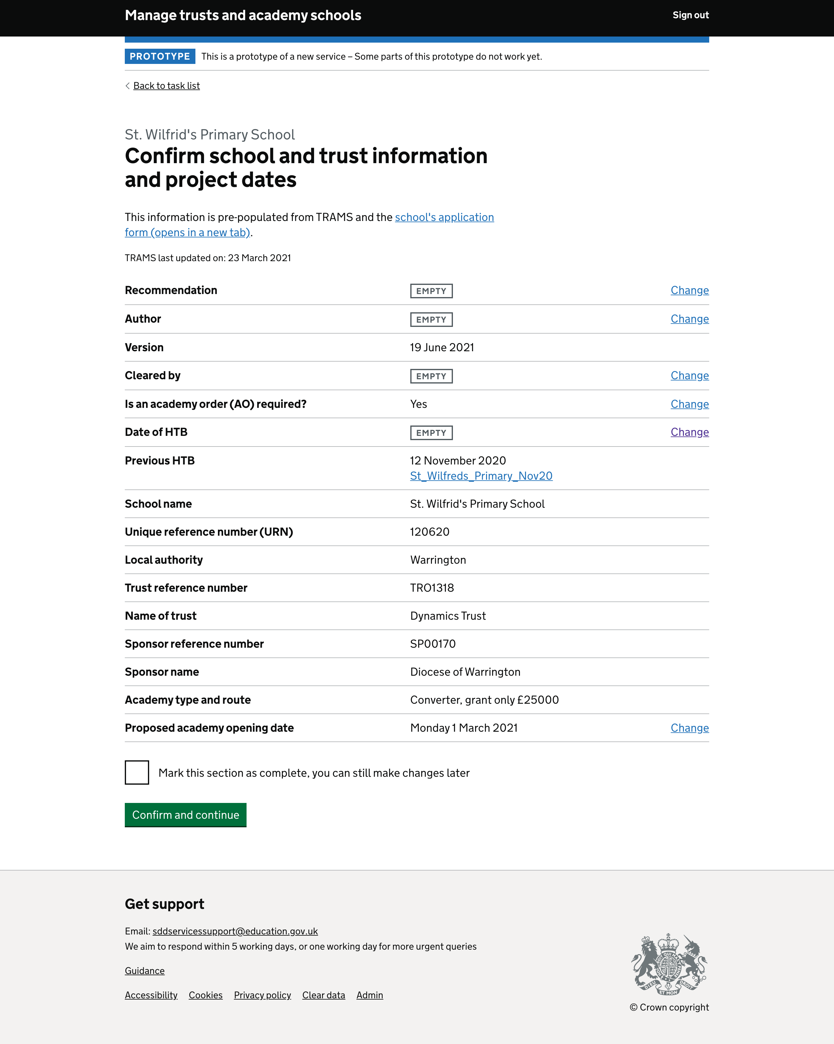
Task - distance from school
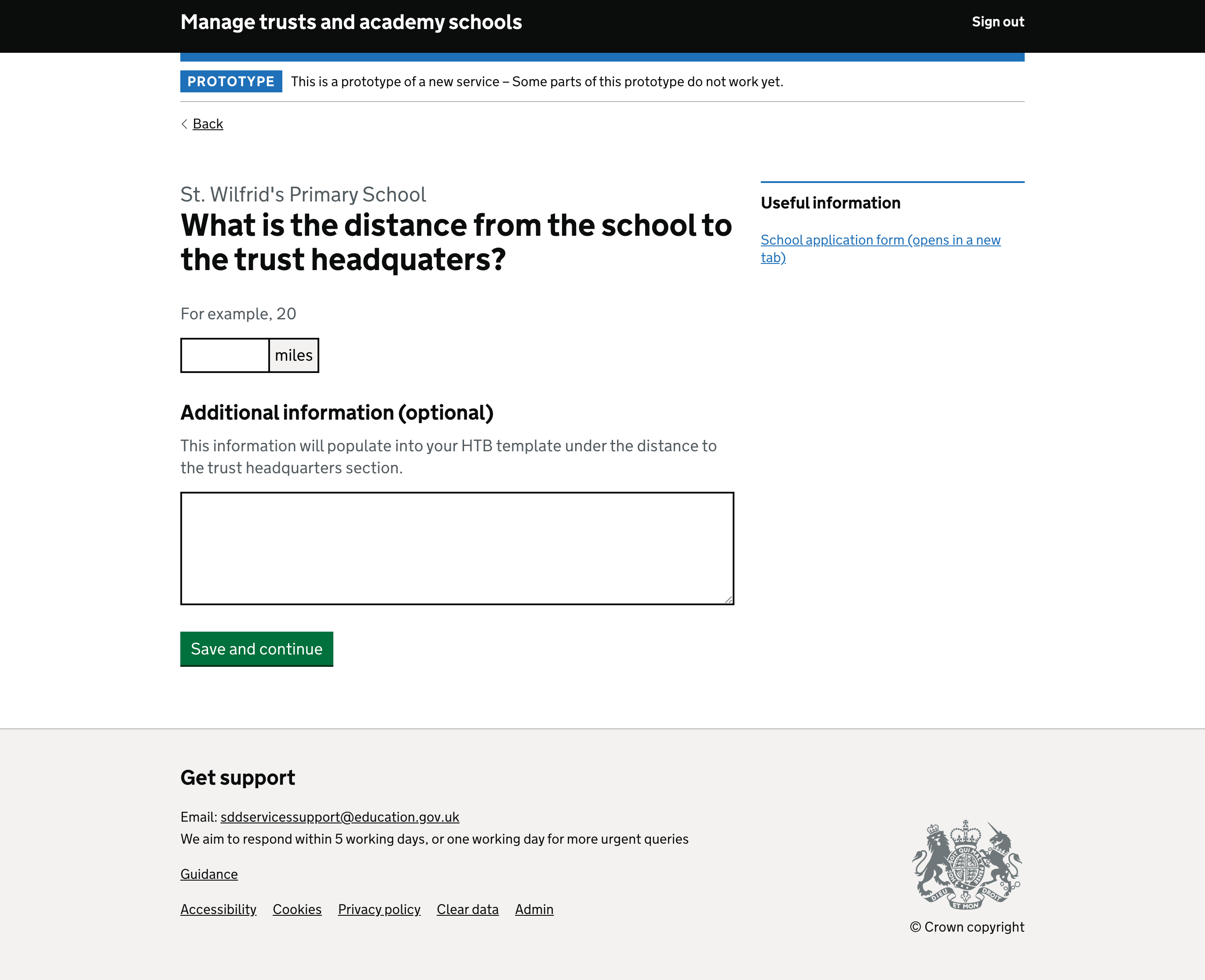
OFSTED (reference only section)
Budget information
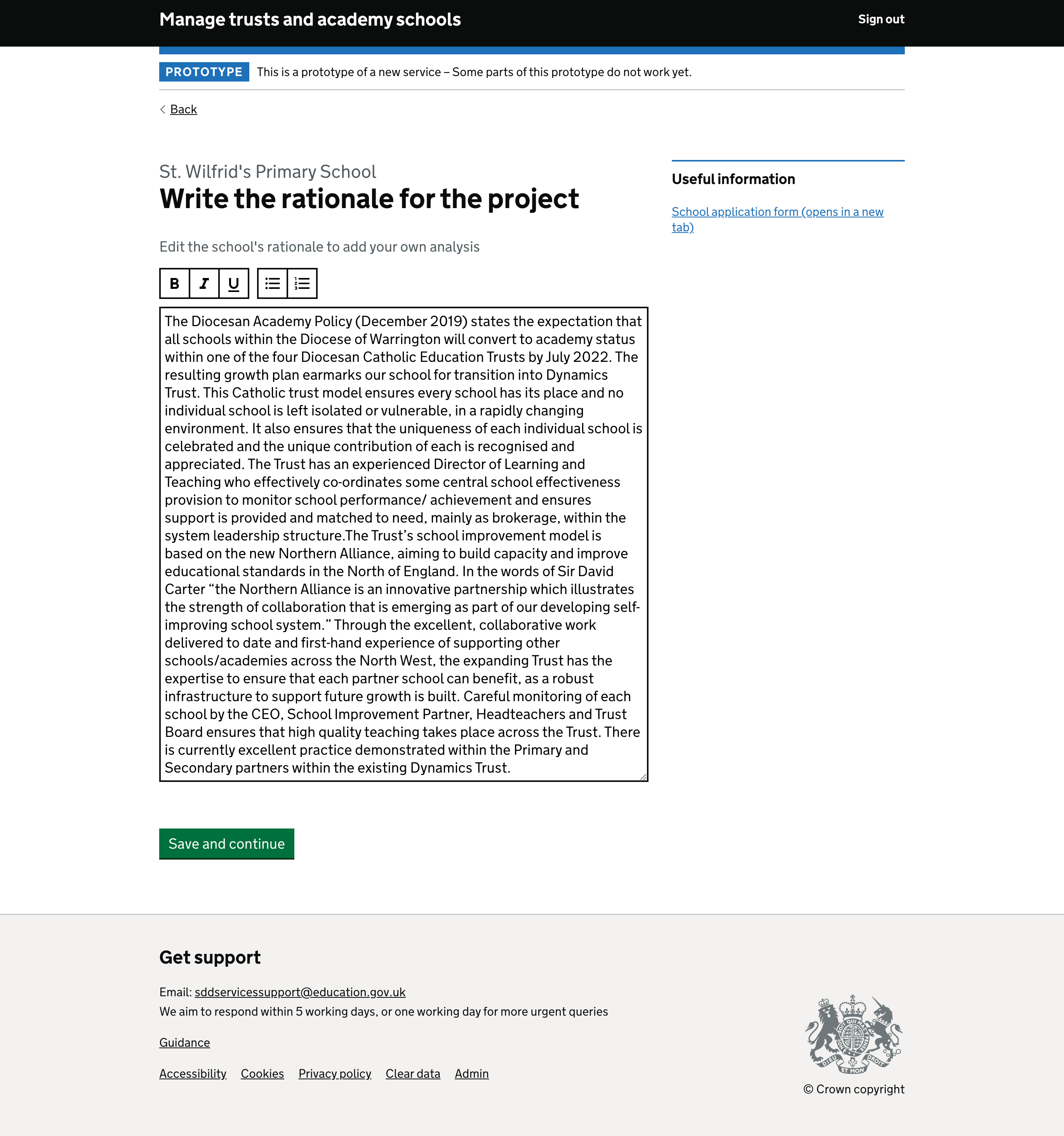
Rationale
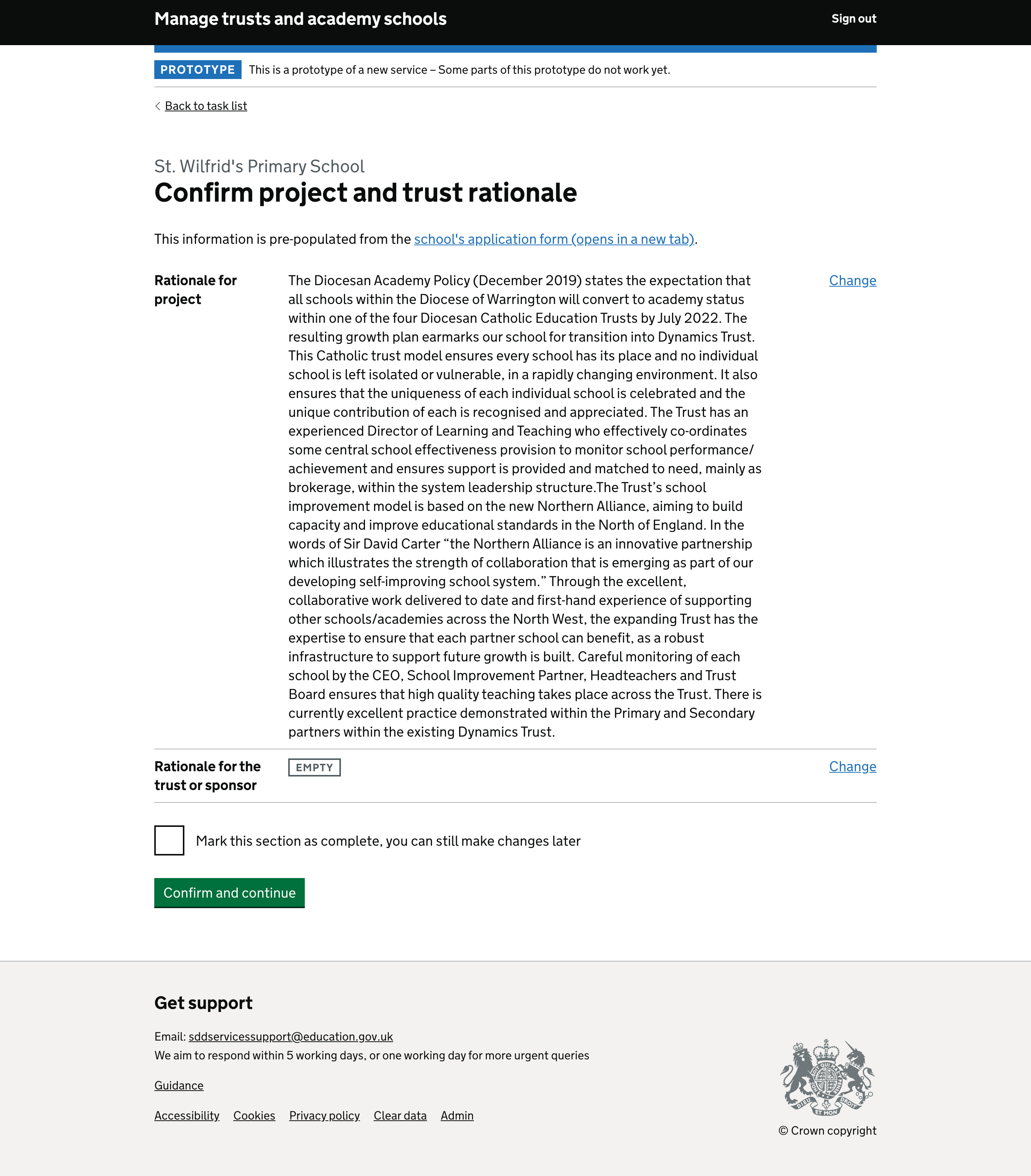
Rationale summary
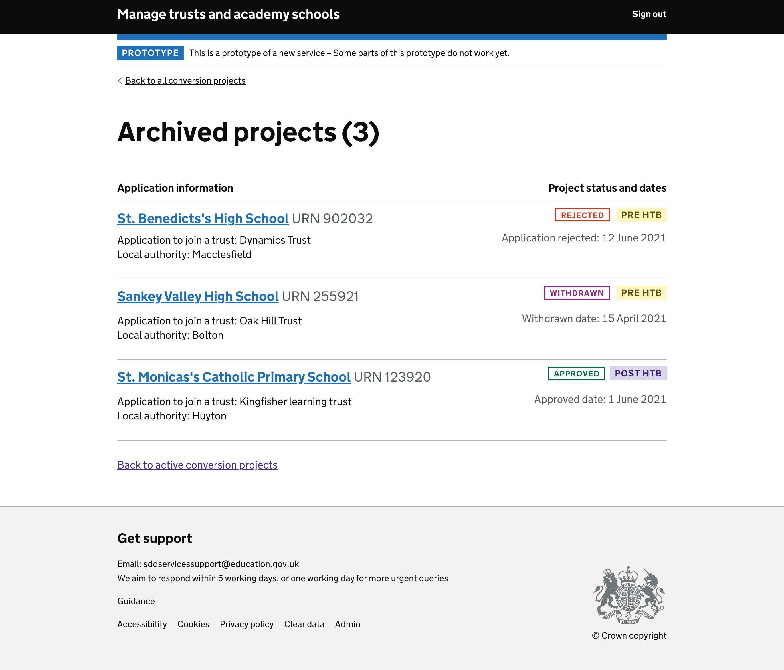
Archived projects
Preview HTB

Final documents
